
I was just explaining to my roommate about phishing scams and why many online banking websites now show you a personal picture when you log in. And I was reminded that the main usability problem at the heart of phishing scams is the URL naming scheme. It’s just unnecessarily complicated to figure out.
What do I mean? The very heart of a phishing scheme is a URL at the top of the page such as:
http://www.bankofamerica.com.online.b04k.li/login.html
And the only way to know that it’s a phishing site is to consciensciously look at the last part of the first part of the url, which is the part that has all period separators and comes before the first slash, except after the two slashes at the very beginning. Sheesh! Although web nerds have gotten used to this, it does not even remotely resemble an intuitive user experience. People see the “bankofamerica.com” portion out of the corner of their eye and assume all is well.
If URLs simply worked from left to right, the real Bank of America would be: http://com.bankofamerica.www/login.html and the phishing scam would be: http://li.b04k.online.bankofamerica.www/login.html
Then at least we could tell everyone to just look at the leftmost thing (after the unchanging http://) and make sure it is familiar.
Of course, this is not really an option anymore because there’s way too much infrastructure in place using the existing naming scheme. But why don’t web browsers at least highlight the important part of the URL for you? It could look something like this: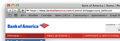
And then the scam would at least have a chance of catching your eye: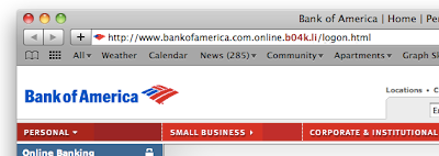
And I could tell my grandma, “just look at the bold red portion before you enter your password.”
Does anyone know why the major browsers don’t already do this?
Update: Dave just pointed out that Internet Explorer 8 has indeed publicly announced a similar domain highlighting feature:
Domain Highlighting lets you more easily interpret web addresses (URLs) to help you avoid deceptive and phishing sites that attempt to trick you with misleading addresses. It does this by highlighting the domain name in the address bar in black, with the remainder of the URL string in gray, making for easier identification of the sites [sic] true identity.
Update 2: Google Chrome does something similar — it colors the “https” green if the site comes with a valid security certificate. It also makes the domain name darker than the stuff after the “/”, but it doesn’t do anything to distinguish the top-level domain pieces. So it is still open to phishing attacks like “www.bankofamerica.com.online.b04k.li”. Hopefully, phishing sites wouldn’t be able to get a green “https”, but the lack of a green prefix seems a lot less noticeable than the clear presence of a suspect top-level domain.

If we reversed the order of the domain listings in the URL, wouldn't people just get conditioned to look at the end of the URL instead of the beginning?
I've started just googling for the site whenever I need to go to a bank or similar.
The problem as I see it is that people aren't getting conditioned at all — they don't notice when the recognizable part of the domain shows up in the wrong place. The point of reversing the order is to simplify the domain-reading process in the hopes that it would be more memorable.