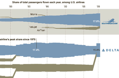
An interesting infographic is being passed around today from the New York Times. (Click the excerpt below for the full graphic.)
I suspect that much of this was hand-crafted using an illustration program. Notice how the merger at the right end of Delta’s row maintains the vertical center from before the merger, whereas in most other places the incoming merger adjusts the vertical center by adding on to the top or bottom of the previous bar.

